
Three forms of composition

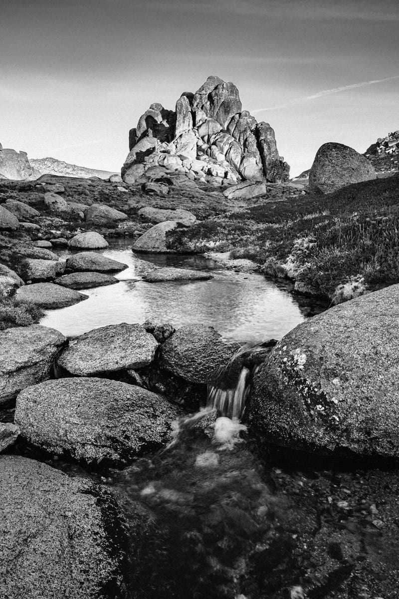
There are a lot of elements that go into the making of a great photograph. I would argue that the most important, and the most challenging to learn, is composition. In this newsletter, I will outline two practical ways to visualise composition in the field and when editing.
The ability to make a technically sound image is important (although there are many great photos that are less than technically perfect). Modern cameras and editing software mean that getting right the exposure, focus, contrast and so on is easier than ever. Strong technical skills are critical to making the most of the conditions and subject. And certainly, a photographer needs to understand the subject and light in front of them to make an intentional image. But a technical correct image of an interesting subject in nice light can still feel lacking.
The key to filling this gap is how the objects in the frame are arranged relative to each other. Composition – the design of the image – can make all the difference in turning a two-dimensional photograph into an aesthetically pleasing and engaging image.
There is no easy way to learn composition. It takes time and experimentation, gradually learning what works and what doesn’t.
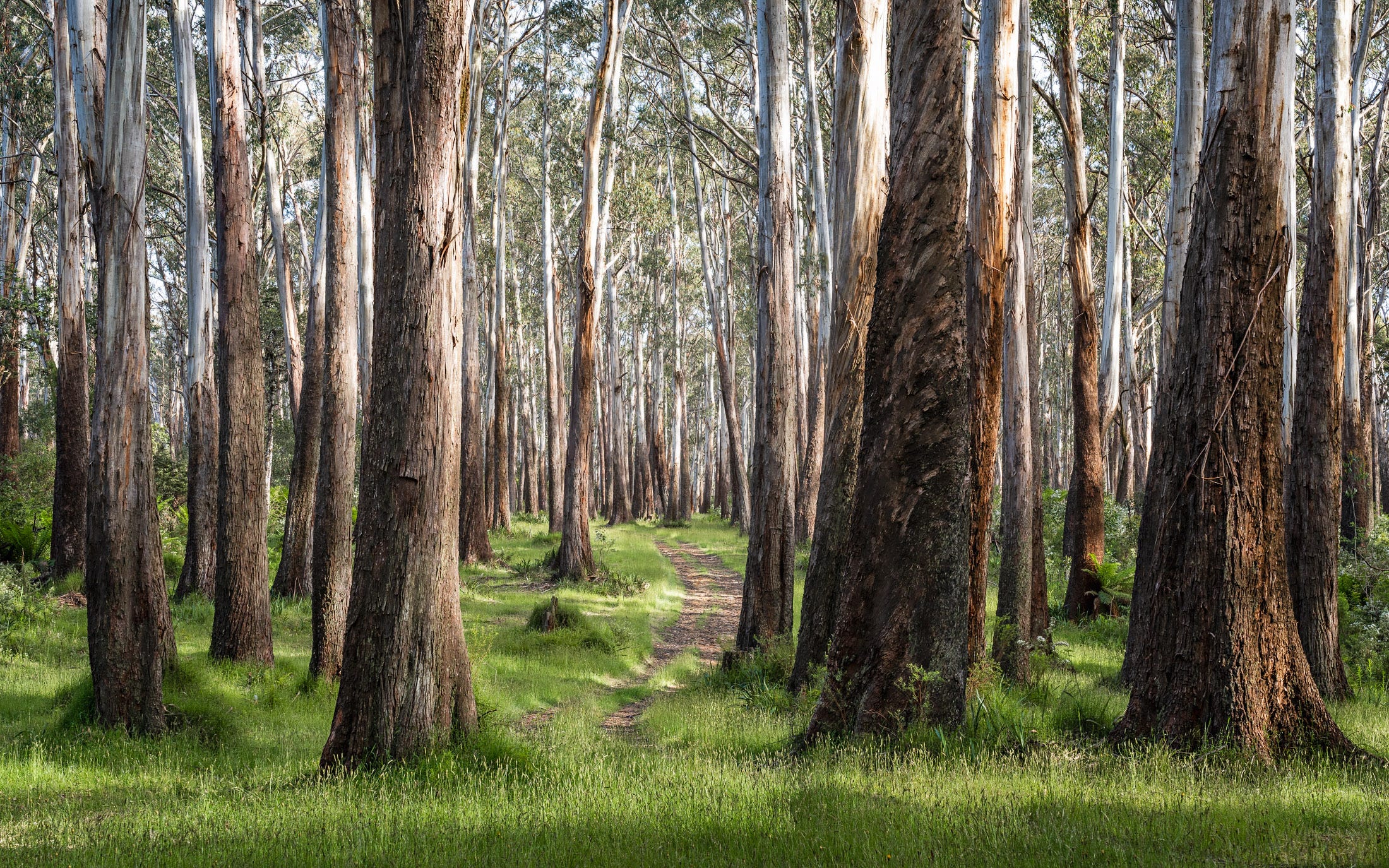
One idea that I learnt during an online course with Les Walkling1 is to think about three different forms of composition – drawing, colour and tonal.
As part of some courses, Les provides a Photoshop action that creates three layers separating these different compositions. For the image above, below is the RAW file, and a distillation of these three compositions. Understanding these compositions can be very helpful in making editing decisions.
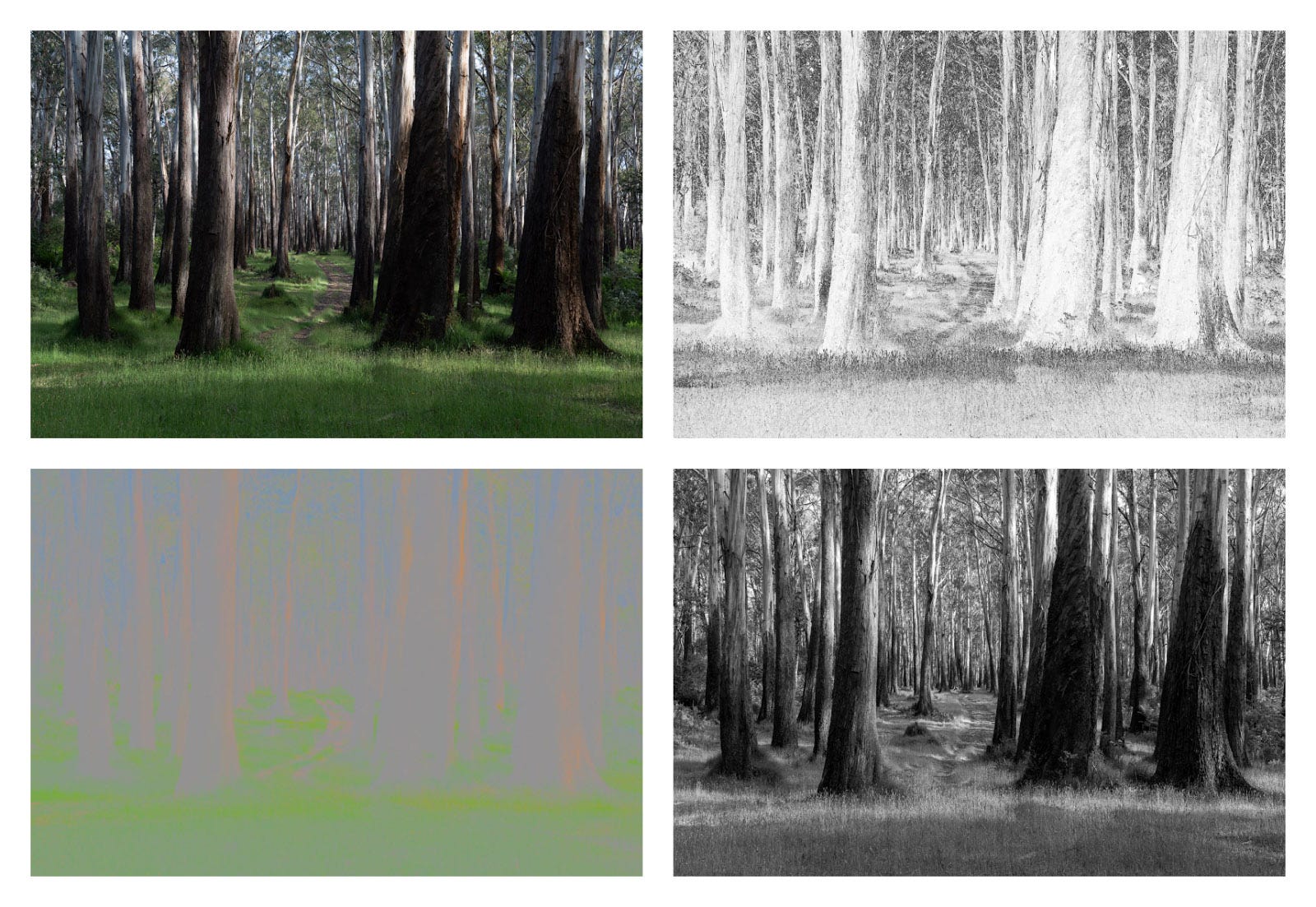
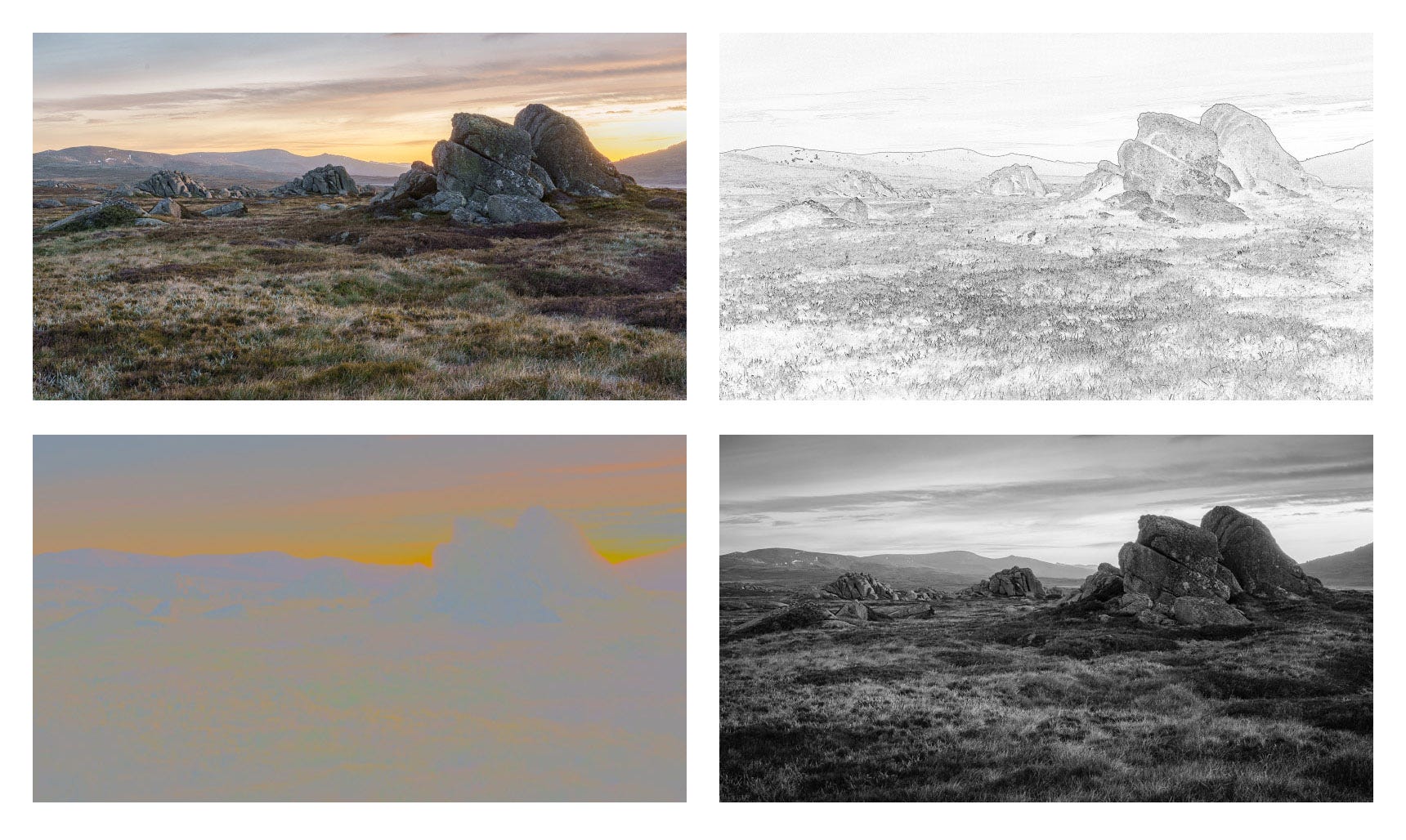
The drawing composition removes colour and highlights only the edges in the image. This is useful when thinking about what to include in the frame and what to exclude. It is well known that photography is a game of subtraction. What is the subject? What objects do I want in the frame? What do I want to exclude? Once these decisions are made, the question is how to arrange the objects in the frame.
It is the drawing composition – defining the relationship between objects – that are at the centre of many of the “rules” of composition such as the rule of thirds, the use of leading lines or the placement of foreground elements to create a sense of depth.
Note that some of these relationships between objects are actual – the road leading to the horizon for example. But some relationships are perceived or imaginary. For example, the space between trees creates space that leads the eye into the image.
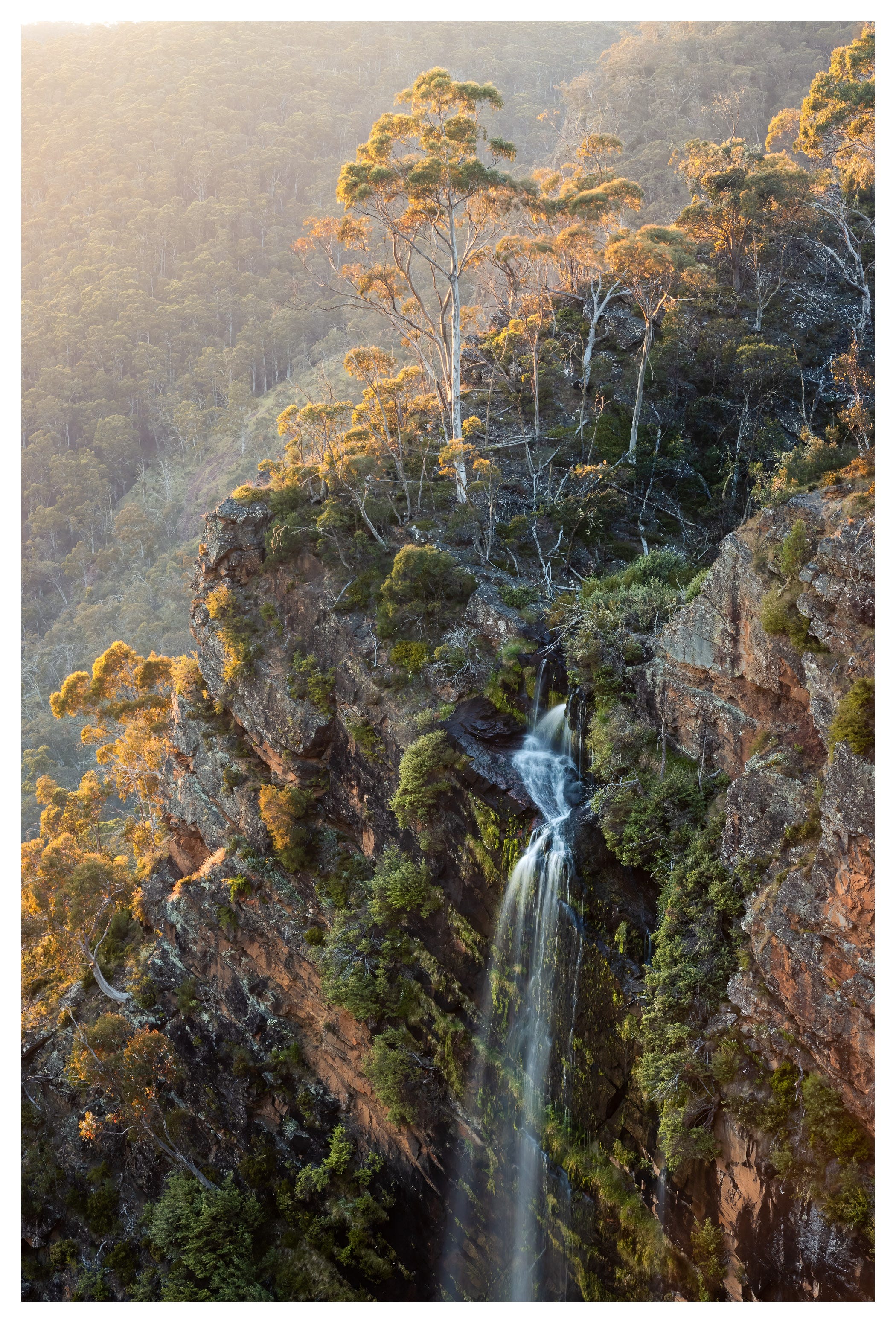
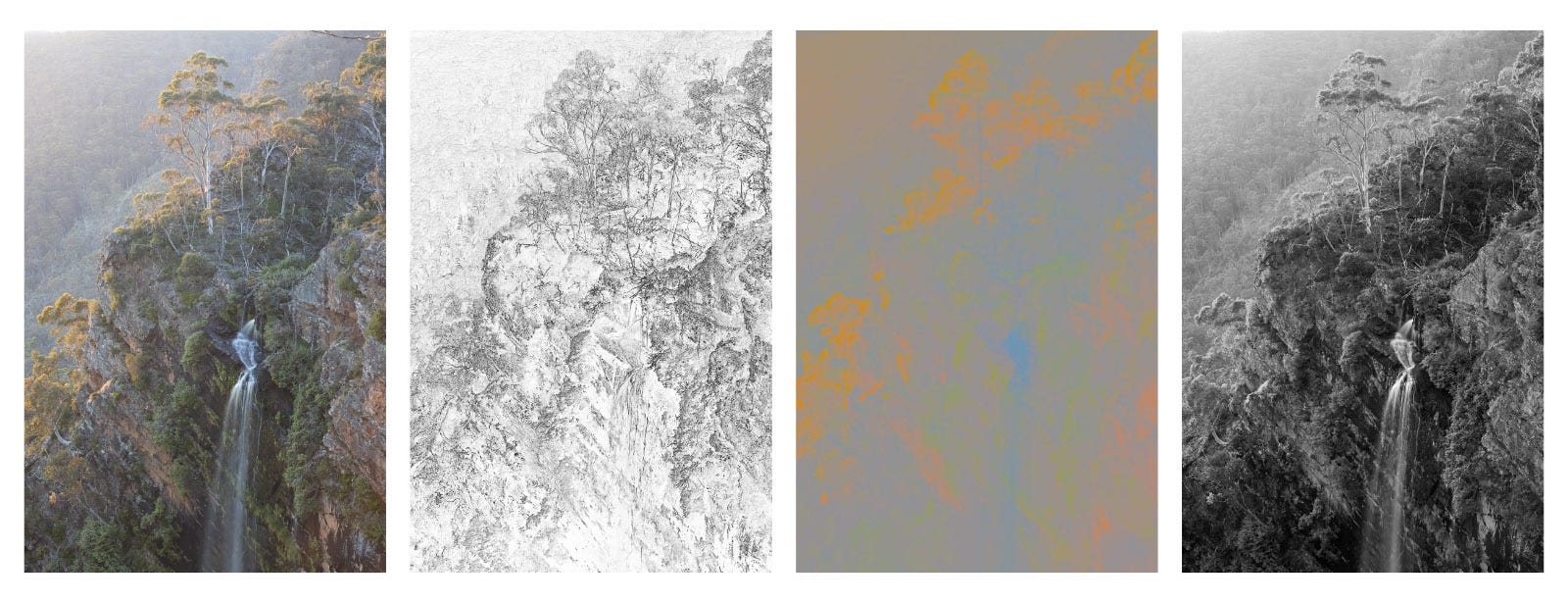
Colour composition shows hue and saturation without tonal graduation. It is useful for thinking about using colour to create colour contrast and mood and how to create a perception of depth – warmer, brighter colours come forward, while cooler, darker colours recede.
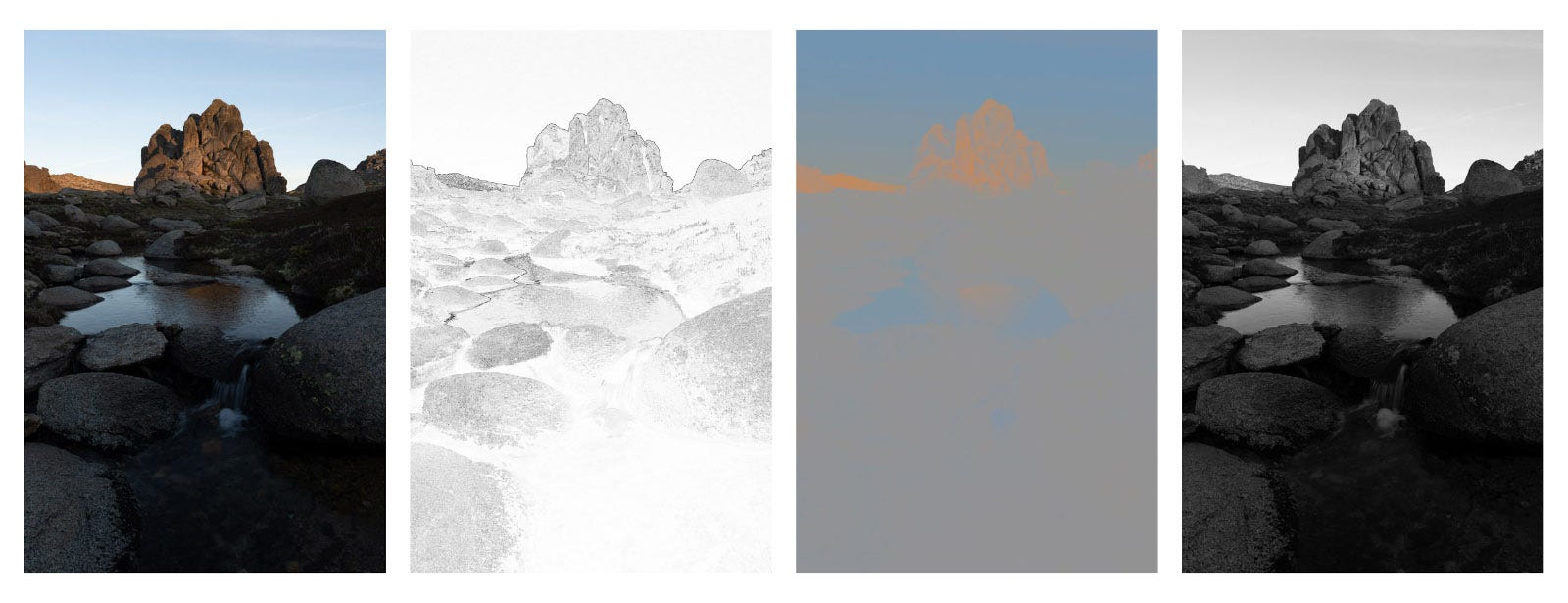
Tonal composition highlights what is brighter or darker, sharper or softer. Of all the types of composition, I find the tones in a scene to be the hardest to visualise.
In Practice
You don’t need this Photoshop Action to think about these compositions. With a bit of practice they become easier to visualise. While creating compositions is largely instinctive, if I were to try and break down my thinking, it would go as follows.
In the field, I start by visualising the drawing composition. What objects do I want in the frame and how should they be placed relative to each other? How do I want the eye to travel through the image? At this point I will also check the edges for unwanted distractions and make sure the corners anchor the frame.
I think about colour. What is the white balance? Are there specific areas I might want to warm up or cool down?
I find the tonal values are the hardest to visualise. This is why I set my Manual mode to show the preview on the EVF and back screen in black and white2.
By this point, I usually I have a good sense of what my edit will be, at least my initial attempt (although there are plenty of times when I might take the edit in a different direction once I see the image on the screen).
Bringing all these elements together in the field and then in editing software is difficult. Sometimes there is a magic that just happens, where it comes together through instinct and luck and the image becomes much more than the sum of its parts.

Les Walkling has 50 years of working full time as an artist and educator at the intersection of art and technology. He delivers a range of online courses where he brings together technical excellence and an artistic sensibility. A lot of information can be found on his website here and YouTube channel.
On my Sony a7 iv this is achieved by choosing a mode to use (I use Manual), then Exposure/Colour>Colour/Tone>Creative Look>BW. This greatly helps seeing the tonal values and all the colour data will still be captured in the RAW file.
Completely new concept for me. Will have to play with it. Beautiful Photos!!
“Photography is a game of subtraction”
The amazing thing is that I’ve never heard it stated this way before. You’re absolutely right and this is a brilliant way to approach it! I really got a lot out of these insights into your process. Thanks for sharing them James!